California State University, Long Beach
Department of Geography
Hazards Lab
Flood Magnitude-Frequency Relationships

This lab will familiarize you with magnitude-frequency relationships in risk analysis. Many natural hazards show a pattern where low magnitude events happen pretty frequently, while high magnitude events are rare. Earthquakes, taken as a whole from around the world, fit this pattern. Asteroid and comet impacts with Earth or its atmosphere are another hazard that behaves this way. So do floods along a particular stretch of river.
Floods (and other hazards) can be characterized by magnitude, how large or energetic they are. With floods, a common measure of magnitude is discharge, or how much water in the stream bed is flowing past a certain point in a given period of time. For example, discharge could be given in cumecs or cubic meters per second or, as in this lab, as cfs or cubic feet per second.
If you have a long run of discharge data for a particular stream, you can rank each year or event by its discharge. So, the biggest flood would be ranked #1, the second biggest as #2, the third biggest as #3, and so on until you have ranked even the tiniest event.
Once you've ranked your data set, you are in a position to calculate recurrence intervals or frequencies. Recurrence interval means the average number of years between one flood of a given magnitude and the next flood that is as big or bigger. If you were interested in a flood of, say, magnitude 5,000 cumecs, you would figure out the average time it would take to get another flood of at least 5,000 cumecs. Conversely, frequency would be how often a flood of a given magnitude is matched or surpassed in a given time interval, such as a century.
Once you have recurrence interval, you can figure out the probability that a flood of a given magnitude will hit during any particular year. Probability is merely the reciprocal of recurrence interval, that is, 1 divided by the recurrence Interval ( 1 / I ).
Something else you can figure out from recurrence interval is the magnitude of a specified level of flood. In other words, you can estimate the size of the 100 year flood (the flood level that has a 0.01 or 1% chance of happening in any given year: 0.01 is the reciprocal of 100). Planners and insurance companies like to think in nice, round recurrence intervals (e.g., the "100 year flood" or the "500 year flood").
Use of regression modelling can help you predict that kind of flood, even if you don't have 100 years of data (which we don't in this lab). The idea is you model the relationship between magnitude and frequency from the data you have, using simple linear regression, and then extrapolate that relationship to times outside the years of your data set.
Extrapolation can be a bit hazardous, because there is always some uncertainty in this kind of modelling, and the uncertainties increase the farther you extrapolate beyond your data. Keeping that in mind, extrapolation can give us at least a ball-park idea of the kinds of floods we might have to face and plan for.
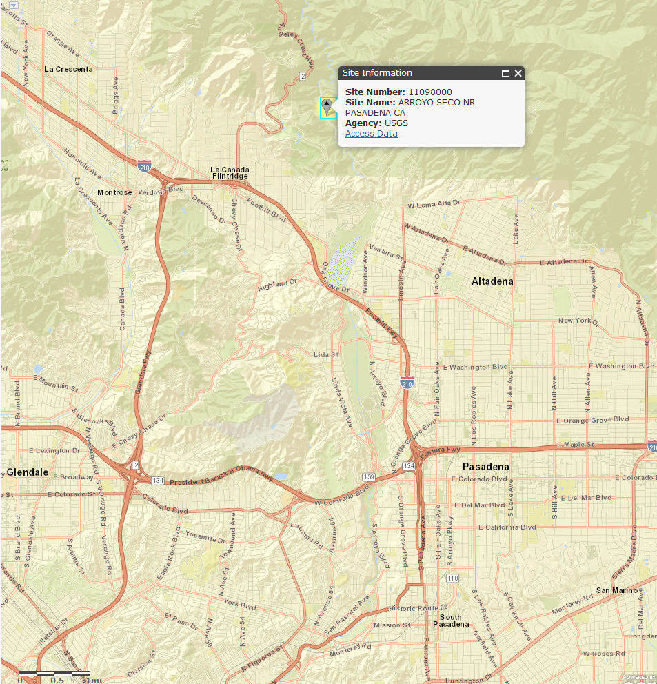
The data used for this lab come from the USGS WATSTORE water data warehouse. They represent an 89 year run of peak discharge data taken from station 11098000 in Arroyo Seco near Pasadena for every flood year from 1914 (1 October 1913 through 30 September 1914), except for 1933. The peak discharge event for each water year is listed by the date it was recorded. Peak discharge is given in cubic feet per second (cfs).
What's a "water year"? It is conventionally defined as the twelve month period from October 1st through September 30th. The water year is named for the calendar year in which it ends (which includes nine of the twelve months). For example, the year ending on September 30th of 2005 is called the "2005 water year." Because of this water year business, you will notice a couple of peak discharge events may have occurred during the same calendar year (e.g., 1996) and some calendar years are missing an event (e.g., 1997)
Skills developed in this lab include:
- basic spreadsheet functions, such as sorting, counting, writing equations, copying formulas, and formatting
- using OpenOffice (or LibreOffice) Calc to create graphs
- building a simple linear regression model in OpenOffice/LibreOffice
- trying out a mathematical transformation to straighten out a curvilinear relationship to improve the simple linear regression model
- access to OpenOffice/LibreOffice Calc or a comparable spreadsheet program (if you use Excel, Google Sheets, or whatever, you will need to figure out the analogous commands ...). If you haven't already, please download and install OpenOffice or LibreOffice now -- it's free, nicely organized, free, powerful, free, doesn't require renewing licenses, and free :-)
- access to the Internet
- answers filled out in the answer sheet (https://home.csulb.edu/~rodrigue/geog558/labs/floods/floodlabanswersheet.ods, so you don't need to scan this whole lab). If you prefer to print, handwrite your answers, and scan them, here's a printable pdf: https://home.csulb.edu/~rodrigue/geog558/labs/floods/floodlabanswersheet.pdf
- two graphs showing your scatterplots and regression lines (these can be copied out of the Calc spreadsheet and pasted in the Writer word processor or Word or the Impress viewgraphs program or Powerpoint). Alternatively, you can highlight the graph, including one row and column of spreadsheet on all sides and ask it to File --> Print and request Selected Cells only.
- files deposited in the Canvas Assignments dropbox for this lab
Part 1: Download Your Data
By clicking https://home.csulb.edu/~rodrigue/geog558/labs/floods/floodlab.ods, you can download your data in the form of an OpenOffice/LibreOffice workbook. You may be warned that you are about to download a file and not given the chance to open it anyway. If so, just select Save File and then be sure to pick your own disk or USB flash drive to save it in or, if you're at home, wherever you save your Hazards "stuff."
If it opens when you click on the link, great. Otherwise, if you had to Save File, go on and open OpenOffice/LibreOffice first and then have it open the file. This is actually the safest option, saving the download, firing up Calc, and using it to navigate to and open the saved file.
You will find three columns of data in the FloodLA sheet: Date in Column A and Discharge in Column E and Discharge again in Column G (the duplication is to make your graphing life easier). The data run from row 2 through row 90. In a separate sheet (the Metadata tab), you'll find a few rows of "metadata," data describing the data above. These are in comment lines preceded by an #, and you don't need to worry about them: I'm simply trying to provide appropriate credits by including the WATSTORE variable explanations. In the main FloodLA sheet, you'll see that there are four empty columns. Column B is headed by "Rank," Column C by "R Prob," Column D by "RI," and Column F by "Log RI." These are the columns that you'll be filling in during this lab.
Let's make sure that the spreadsheet will show your calculations in an attractive format, rounded to two decimal places (e.g., 22.04). Holding down the Control key, tap the grey boxes on top labelled C, D, and F. This will cause the three columns to be highlighted. Then, touch the Format box up in the menu on top of OpenOffice/LibreOffice. When the menu drops down, choose Cells. A box should come up and the Number tab should be active (if not, click on Number). Under Category, choose Number and then, under Options, you should see Decimal Places. Select 2. Then, hit OK. Now, any number that you put in any of those three columns will be displayed with two decimal places. Making sure a spreadsheet has columns of numbers that are right-justified (and the label above them is also right-justified) and show the same number of decimal places is good form and makes it a lot easier for a reader to interpret. Actually, I already did this but, if it doesn't give you your calculations in two decimal places of accuracy, you'll know how to fix it.
Part 2: Calculate Estimated Recurrence Intervals
The formula for recurrence intervals is:I = (n + 1) / rWhere:I = Interval of recurrenceTo estimate probabilities of recurrence in any one year, the formula is:
n = number of years for which you have data (don't forget that water year 1933 has no data)
r = rank of a particular magnitude of event, e.g., 509 cfsP = 1/ IWhere:P = Probability of recurrenceTo make sense of this, go to the spreadsheet, put your cursor in the grey box that labels row number 2, and then left-click and drag the cursor to the grey box labelled row 90. All rows with data in them should now appear highlighted.
I = Interval of recurrenceOn the upper OpenOffice/LibreOffice Calc menu bar, click on Data and then on Sort. Up will come a grey box, asking you to sort by one of the columns of data. Choose E. Click on Descending, so your data are arranged from highest discharge to lowest. Then click OK. Voilà! Your peak flow data are neatly ranked from the largest to the smallest peak discharge event. Now save your file (Control-S), either as a Open Document Spreadsheet .ods file or any other format that suits the spreadsheet software you have access to.
Part 3: Using OpenOffice/LibreOffice Calc's Formula Function (Recurrence Interval and Probability)
At this point, you can assign ranks to your floods. You'll see that Column B is already labelled "Rank" up in cell B1. The easiest way to rank your sorted data is to put the number 1 in cell B2. Then, in cell B3, enter the following: =b2+1 and hit Enter.Now, put the cursor back in cell B3. Move the cursor to the lower right corner of that cell and you'll see it turn from an arrow to a skinny black crosshair, like cross-hairs. As soon as that happens, hold down the left-click button on the mouse and then drag the mouse down the column to cell B89 (don't bother with 1933 in cell B90). All your ranking will be done automatically. Now, you can count your water years.
Question 1: What, then, is n (not counting 1933)? __________
(a shortcut: Type =count(b2:b89) in cell B92 -- it'll count them up for you and we can use that cell for recurrence interval calculation)
Now that you know the ranks for each water year, use the formulas above to calculate recurrence intervals in years, and probabilities of recurrence in any one year for the following discharges. To do this, let's first calculate recurrence intervals: Please put your cursor in cell D2 under the "RI" heading. Type in =(B$92+1)/B2 and hit Enter. You now have the recurrence interval for the largest flood in your data set. Again, put your cursor back on cell D2 and move it to the lower right corner of the cell until it turns back into a cross-hair again and then hold down the left mouse button and drag the formula all the way down to cell D89. Almost painless calculation of recurrence intervals for all your records!
From recurrence interval for each rank of flood event, you can calculate the probability of a particular level of flood hazard. All you need to do is take the reciprocal of the recurrence interval. That means divide 1 by the recurrence interval for the flood you're interested in. So, in cell C2 under "R Prob," type in =1/D2. Again, put your cursor back on cell C2 and move it to the lower left corner until it changes to a cross-hair and left-drag the mouse all the way to C89.
Question 2: So, what would be the discharge associated with the 80th ranked flood?_______________ CFSQuestion 3: What is the recurrence interval for a flood of 230 cfs?
_______________ YEARSQuestion 4: What is the probability that next year will equal or exceed 1,400 cfs?
_______________Question 5: What is the rank of the 1,800 cfs flood?_______________Question 6: What is the discharge associated with the 11th ranked flood?_______________ CFSQuestion 7: What is the recurrence interval of the flood that has a 0.03 probability of occurring next year?_______________ YEARSQuestion 8: What is the probability of getting a flood of at least 8,540 cfs next year?_______________
Part 4: Graph Recurrence Interval and Magnitude
Let's graph that, while we're at it. First, holding down the left mouse button, drag the cursor from cell D2 down and across to cell E89 and let go. Once the D2:E89 range is highlighted, click the icon on the top of the OpenOffice/LibreOffice Calc screen, which looks like a miniature, loudly colored bar chart or pie chart. In the Choose a Chart Type dialogue box, select X-Y (Scatter), and then Next to accept the default scatterplot. Instant art!Then hit Next again. And twice more, landing you in the "Choose titles, legends, and grid settings" dialogue box. For Chart Title, try "Discharge and Recurrence Interval" or some such. For Value (X) Axis, put in "Recurrence Interval" or "RI." For Value (Y) Axis, put in "Discharge (cfs)" or "D (cfs)." Then, unclick the Display Legend box (it's useless here). Hit Finish.
The graph comes up, inconveniently located in your spreadsheet, probably covering up your data. Move your cursor to someplace on the grey border of the graph, so that the cursor changes to a crossed pair of small arrows. Then, holding down the left mouse button, move it somewhere more useful, such as cell I1 or I2.
Optional Bonus
If you're feeling artistically inclined, there are all kinds of (strictly optional) cool options in OpenOffice/LibreOffice for prettying up a graph. You can edit a graph any time you see the thick grey border with pin boxes on each side and corner. If it does not look like that, you only need to double-click on it to put it back in editing mode. You can change the scatterplot dots by tapping one, so they all light up, right-clicking, and picking Object Properties. You can knock yourself out in there futzing around with the choices.You can double-click on the white area of the chart away from the titles, axes, and chart wall and again right-click to get the menu and its Object Properties options. You can put a line around the chart (a neat-line) in the Borders tab, change the color of the whole chart under Area, and mess around with all kinds of special effects under Transparency. You will be dismayed, perhaps, by having the color appear throughout the whole chart, including the chart wall behind the dots. Not to worry, you can tap on the chart wall and, when you see green squares marking off just that area, you can right-click, select Object Properties, select Color under Area, and then scroll down an click on white or whatever color you fancy. You can click on either axis to change the decimal places of accuracy, the scale range you want on there (unclick Automatic to change anything in any of those tabs).
You can format the axes and titles, too (bolding, italics, color). To do that, while the chart is in editing mode, you can click on Format at the top of the program and the usual formatting choices are replaced by Title, Axis, Grid, and other options, too.
You don't need to unleash your inner artist to do this lab, but I just wanted to let you know how to play around with your graphs for future application in papers, thesis projects, or work! To give you an idea of what you can do in OpenOffice/LibreOffice Calc, here are a few of my own over-the-top creations:
- https://home.csulb.edu/~rodrigue/geog442/biodiversityindices.jpg
- https://home.csulb.edu/~rodrigue/mars/lpsc11/LPSC2011RodrigueFig1.gif
- https://home.csulb.edu/~rodrigue/mars/aag10/5chainsfitted.png
- https://home.csulb.edu/~rodrigue/gdep/pHsensors.jpg
- https://home.csulb.edu/~rodrigue/gdep/penetrometerbyquadrat.jpg
Part 5: Analysis of Your Graph with Simple Linear Regression
How would you characterize the relationship between recurrence interval and discharge just using the eyeball method? A direct relationship exists when one variable goes up as the other one goes up in value, so it creates a curve going from the lower left of an X-Y graph to the upper right. An inverse relationship exists when one variable drops as the other one climbs in value. It creates a curve going from the upper left to the lower right.
Question 9: Is the relationship between recurrence interval and discharge direct or inverse? __________________________The longer the recurrence interval, the worse the flood discharge associated with it is. This relationship is the basis of predicting areas subject to the "100 year flood" for insurance purposes.Let's use simple linear regression to fit a curve to these data, so we can come up with very rough estimates of the flood magnitude associated with a particular recurrence interval.
A regression model has the form:
Y = a + bXWhere:In cell B113, type =correl(e2:e89;d2:d89) (equals e2 colon e89 semi- colon d2 colon d89). That is your correlation coëfficient or R, showing the association between recurrence interval and discharge. R can vary from -1 through 0 to +1. The larger the correlation coëfficient, the stronger the association. A -1 describes a perfect inverse relationship; a +1 describes a perfect direct relationship; and a 0 means there is absolutely no association whatsoever between the two variables.
- Y = Expected or modelled Discharge
- a = Y intercept, or where the curve touches the Y or vertical axis
- b = slope of the equation, or the amount of change in Y seen with a given change in X
- X = Recurrence Interval
In cell B114, write =B113^2 (equals B113 shift-6 2: shift-6 or ^ raises B113 to the second power or squares it). R2 is the coëfficient of determination, which tells you the proportion of variation in Discharge that is explained by variation in Recurrence Interval. Again, the closer to +1, the better your model. If it's under +0.25, X is generally not really a significant predictor of Y; if it's somewhere around +0.25 to, oh, +0.50, it's a weak influence though it may be real (significant); if it's +0.50 to +0.75, you might think of X as a moderate influence on Y; if it's somewhere around +0.75 to 1.00, X looks like a pretty strong predictor of Y.
In cell B115, type =intercept(e2:e89;d2:d89). This is the intercept or a. It tells you where the regression curve crosses the vertical or Y axis if X is 0, basically, where to start the curve.
In cell B116, type =slope(e2:e89;d2:d89). This is the slope the curve makes, or the angle it makes with the X axis (horizontal axis). B is affected by the form of the association between the two variables and the units used to measure each variable: The exact same relationship will have a different slope if Y is measured, say, in cfs or in cumecs. That said, a positive number means a direct or positive association; a negative slope means an inverse or negative association.
Question 10: What is R? __________What good is this? Well, we can use this formula to estimate the discharge (Y) of the 100 year flood by plugging numbers into it, now that your spreadsheet has calculated the a and b constants. Use cell B118 to multiply 100 by the b coëfficient and then add the answer to the a coëfficient. On other words, type in =100*b116+b115. That is the estimated discharge for the 100 year flood, the one that has a 0.01 probability of occurring in any one year. That's all there is to it!Question 11: What is R2? __________
Question: 12: What is a? __________
Question 13: What is b? __________
You can keep re-using cell B118 to create scenarios to answer questions 14 to 17 (putting your answers in the answer sheet!).
Question 14: The estimated discharge for the 100 year flood is? __________ cfsThis should bother you a little: Compare the estimated 29.67 year flood with the real 29.67 year flood. Why do you suppose you got somewhat surprising results? That is, why isn't the estimated discharge the same value as the real or observed discharge data given for the 88 year flood in your table of original data? (helpful hints in Note below):Question 15: What about the 500 year flood? __________ cfs
Question 16: And the 1,000 year flood? __________ cfs
Question 17: Now, do this estimate for the 29.67 year flood: __________ cfs
Question 18:
_________________________________________________________________________________________
_________________________________________________________________________________________
_________________________________________________________________________________________
Note: Disparities between actual values and expected values demonstrate that your independent (X) value does not completely account for the variation in the dependent (Y) variable. This is why, in the real world, correlation coëfficients are not +1.00. When you square the correlation coëfficient, you get the coëfficient of determination (R2), which tells you how much of the variation in Y can be accounted for by variations in X. Take a look at your regression model's R2 -- you can see that a pretty sizable amount of variation in discharge remains to be explained after you've accounted for recurrence interval.
This can be the result of one or more factors independently affecting Y. You can try to build a more complex model by bringing in other variables if you have reason to suspect their presence (multiple regression models can handle multiple independent variables, but that's beyond what we're doing in this lab). Another reason may be that we're applying the wrong model (simple linear regression), but let's not worry about that right now (though we will in a bit).
The difference between an actual value of Y and the expected value of Y for a particular value of X is called the residual. A positive residual is an actual value which lies above the regression line of expected values (is larger than expected); a negative residual is an actual value lying below the regression line (is smaller than expected). Analyzing residuals can often lead to identification of other factors that might soak up some of the unexplained variation in Y. But that's another story for another day!
Part 6: Analysis of Appropriateness of Simple Linear Regression
OpenOffice/LibreOffice Calc can superimpose your regression line right on your graph. Make sure the graph is actively editable. Then, touch one of the data points, so that all of them light up. Right-click to get the menu. Select Add Trendline function. Pick Linear (we're doing a "simple" linear regression, after all). Okay. Pretty handy, eh?Notice how the actual values are consistently below the line on the leftmost side of the graph? And how they are consistently above the line on the right (except for one outlier out there)? This kind of consistency in the residuals tells you that the relationship between recurrence interval and discharge is actually not a linear relationship best described by a simple linear regression model and line. It's actually curvilinear. So what?
This means that our predicted flood discharges are going to be increasingly off as we try to extrapolate way beyond the 88 years for which we have data. And we do want to extrapolate to those round number recurrence intervals, such as the 100 year flood, the 500 year flood, and so on for disaster planning purposes.
If we wanted to improve our model, we can try doing various mathematical transformations on one or both variables. Let's try one of these, which will actually improve our model enough to justify the bother. We're going to do a logarithmic transformation on the X variable, Recurrence Interval.
Part 7: Improving a Simple Linear Regression to Handle a Curvilinear Relationship
What we're going to do is take the common logarithm of Recurrence Interval. A common logarithm is the power you'd need to raise 10 by to get your original Recurrence Interval. If your recurrence interval were, say, 1,000 years, the log of 1,000 would be 3. If you raised 10 to the third power (multiplied 10 by itself 3 times: 10 x 10 x 10), you'd get 1,000. If your recurrence interval were 100, the log would be 2. Try taking the log of 50 by entering 50 on a calculator and hitting the LOG button: 1.699. Okay, let's have OpenOffice or LibreOffice Calc do the heavy lifting for us.In cell F2, type =log(D2). That's all there is to that. Now, drag the formula all the way down to F89.
Let's rebuild the model, down in the work area after Line 122 on your spreadsheet. We're going to retry this simple linear regression thing, but this time on discharge and the logarithm of recurrence interval.
In cell B124, type =correl(G2:G89;F2:F89)
In cell B125, type =B124^2
In cell B126, type =intercept(G2:G89;F2:F89)
In cell B127, type =slope(G2:G89;F2:F89)
Let's do a second chart. Left-click and drag to highlight cells F2:G89. Then, click the chart icon on the top of the OpenOffice/LibreOfice Calc screen. Again, select XY (Scatter), and then Next to accept the default scatterplot.
Then hit Next again. For Chart Title, try "Discharge and Log of Recurrence Interval." For Value (X) Axis, put in "Log RI." For Value (Y) Axis, put in "D (cfs)." Hit Finish.
Once more, the graph comes up, no doubt inconveniently located in your spreadsheet. Move your cursor to the grey boundary of the graph, and drag it somewhere under your first model, maybe cell I44.
Again, click one of the dots and right-click your mouse and pick Add Trendline. Again, choose Linear (because what we've done is used a logarithmic transformation to linearize or straighten a curvilinear relationship). If you're feeling adventurous, you could activate your first graph, click on the trendline, select Object Properties, and then choose Logarithmic -- it would put the second semi-log model's curve directly on the original data!
Look how much better your new regression line fits your data points (and check out how much higher the R and R2 turned out, too). It's not perfect, of course, but it's a lot better and the residuals are a lot smaller. This is a much tighter model. It would be safer to use this model than the first one to extrapolate beyond your data to make rough estimates of expected 100 year floods.
Let's try this. We have to remember to convert the recurrence interval in each of these questions into a logarithm (=log(#), where # is the recurrence interval years mentioned in each question, which I've underlined below). Do that in cell B129. Then, use that logX, together with a from cell B126 and b from cell B127, to calculate Y, which is your expected discharge, in cell B133. So, in cell B133, you'd type =b126+b127*b129. You can "recycle" cells B129 to keep calculating the logs of your recurrence intervals, and B133 will run each scenario you need to answer questions through 22.
Question 19: What would the discharge for the 29.67 year flood be? __________ cfsLet's try this on a discharge NOT actually listed in Column G (no "cheating" shortcuts by eyeballing the data table). What would the recurrence interval be for a 10,000 cfs flood? Plot complication: You have the Y value and you need the X value now. The formula you have, however, is Y = a + b(logX). First, we need to get logX all by itself on one side of the equation and, then, second, get it converted back to a normal number (recurrence interval in years). Not to worry: That's basic algebra.Question 20: What about the 100 year flood? __________ cfs
Question 21: What about the 500 year flood? __________ cfs
Question 22: And the 1,000 year flood? __________ cfs
Question 23: Now for something a little different. Let's move down to the work area beginning in Line 136 of your spreadsheet, what would the recurrence interval be for a flood with a discharge of 3,080 cfs? (this entails looking up that discharge and noting the logarithm of RI in Column F (row 11, spoiler alert) and by typing =10^f11) somewhere convenient -- or, since you have the original data, looking up the corresponding RI in Column D -- er, :-) "cheating") -- you should get the same answer either way. __________ years
     Y = a + b(logX)

     Y - a = b(logX)

     (Y - a) = logX
        b

     X = antilog(logX)

     X = 10logX
So, we're going to plug in the intercept (a) from cell B126 and the slope (b) from cell B127. In cell B138, enter 10,000 as your Y. Subtract a from it and then divide the answer to that subtraction by b. In other words, type (10000-B126)/B127 in Cell B138 (don't forget the parentheses). That gives you logX.Question 24: What is logX (logRI)? __________Now that you have logX, you can turn it back into a normal number (years): Raise 10 to that power (10logX), which you can do on a good calculator or else you can just use cell B144 in your spreadsheet and type =10^#, where "#" stands for the logRI or logX you got for a discharge of 10,000 cfs, or type =10^B138 (because that's where you just calculated logX). The answer is called the antilog. Or just one of us normal numbers for comfortable use in planning.Question 25: What is the antilog of your expected Y (logRI)? __________ years. This is the recurrence interval in regular, familiar years corresponding to a flood matching or topping 10,000 cfs.
Conclusions
So, that's how you can build a model of flood frequency and magnitude and use it to estimate, at least roughly, how big a flood you can expect in a century or a millenium. This, then, helps society plan for life on a floodplain. What kind of land use is appropriate next to a river? How high does a system of levées have to reach to protect human beings and their homes and possessions? How much is society willing to pay for protection against larger (and rarer) floods? How high should your insurance premium be if you choose to live in an area subject to the 100 year (1% chance each year) flood?Unfortunately, most people do not understand the concept of a "100 year flood." They think that, if we had a 100 year flood last year, we are safe from that level of flood and suffering for the rest of their lives. Noooo, it is quite possible to get two 100 year floods back-to-back! A better way of thinking of it is the 1% flood. This is the level of flooding that there is ALWAYS a small chance, a 1% chance, of experiencing any year. The risk is always there, though it may be only 1 small percent in any one year.
Another plot complication is that predicting 100 year floods on a given stretch of river assumes quite a bit:
- Are the years for which you have data actually representative of the climate régime you're living in? That is, are the data from a run of unusually wet years or unusually dry years? The 1922 Colorado River Compact among seven Southwestern states, for example, was negotiated during an unusually wet few decades of data.
- Is the climate changing in a way that could change the flooding behavior of a stream in your part of the world? Much of urban California depends on the Sierra Nevada snowpack. This is expected to dwindle as climate warms, leading to increased spring flooding in the Great Central Valley, as well as intensified summer drought.
- Are there changes to the surface of the watershed upstream from you, such as urban construction or deforestation or overgrazing? If so, that can drastically alter the flood behavior of a stream by changing the timing of when precipitation hits the stream (these human-altered surfaces don't allow water to percolate as efficiently into groundwater, so it all comes roaring down asphalt and concrete and exposed dirt surfaces right into the stream, overwhelming its banks and creating bigger floods that hit faster after a rain).
![[ urban flood hydrograph ]](https://home.csulb.edu/~rodrigue/geog558/hydrographurbanization.jpg)
first placed on the web: 01/25/03
last revised: 11/06/23
Dr. Christine M.
Rodrigue